Templates editor
The Acumbamail template editor allows you to design emails easily and intuitively using a drag & drop system that offers many possibilities for you to create your design from scratch or adapt one of our free templates. In this article, you will learn in detail all the possibilities that the editor offers you.
In this article:
- Select template to edit
- General commands of the editor
- Content
- Rows
- Empty rows
- Predefined rows
- Save custom and synchronized rows
- Edit saved row
- Delete saved row
- Add background color or image to your template
- Settings
- Preview / Show structure
- Responsive for mobile devices
- Best practices to avoid SPAM folder
- Text generation with artificial intelligence
Select template to edit

First, when you are creating a campaign, you can choose between: selecting one of the templates offered by Acumbamail (from New Templates), reusing one you have already used (My Templates) or importing your own template.
You also have the option to start editing two templates from the editor that are fully adapted to your website design, with your logo and corporate colors. To generate them, you just need to access the template overview and enter your website URL.
On the other hand, at any time you can create or modify a template from the Templates section within Newsletters, to use it later in a campaign.

If you want to use one of our templates, you can filter by themes to easily find the one that best fits the campaign you want to send.

Once selected, you will access the editor so you can customize it, modify its structure, or add blocks with different content. The editor consists of three parts:

- The template being edited, on the left.
- The editor itself, divided into content, rows, and settings.
- The buttons at the top left of Preview (view the template on different devices) and Show structure (view the template by grids, which helps to design it more precisely), as well as the option to edit the template in desktop and mobile on the fly, seeing at all times how one version looks compared to the other. For more information about this feature, go to the responsive options section.
General commands of the editor
These are the basic actions required to start using the editor:
- To add a content block to the template, simply drag it to the desired location.
- If you double-click on a specific content block, you can duplicate it, delete it, or drag it to another location by clicking on the white cross.

- Similarly, by double-clicking on specific content, you will have access to its settings on the right side of the editor.

- Keep in mind that the content area is always encompassed within a row, so if you want to modify an element that affects the entire row (for example, the background color), you will need to click on the specific row (the easiest way is to click from the sides).

- When you double-click on a specific row, you will be able to access the general settings for that row on the right.
- If you want to undo any changes, you will find an undo button on the left once you make changes to the template. If you click on the clock icon, you can see the last changes made.


Content
In the Content section you can add different blocks according to your needs. To add each type of content, you just need to drag each block into the template, selecting the place where you want to include it. Each content block has its own characteristics that we detail below.
Title
To add a title block, you must drag the corresponding block to the place in the template where you want to add it. The title block will help you hierarchize the content.

You can enter titles in your email template to hierarchize the content you include, just like on a webpage or a blog with a title 1, 2, and 3 (H1, H2, and H3).
Content properties
In this section, you can configure the following:
- Automatic text generation based on AI (only accessible for Pro and Enterprise plans).
- Change the hierarchy of the specific title (H1, H2, or H3), the font and its size, the text and link color, the line spacing, and the text direction.

Popup toolbar
By clicking on the text itself, a menu or popup bar appears from where you can:
- Change the typography style (bold, italic, underline, strikethrough….)
- Insert special characters
- Change the color of specific text and highlight it in different colors
- Add a link or hyperlink
- Add personalized content to customize your sends with, for example, the name of your subscribers. In this article, we explain this aspect.
Text (obsolete)
⚠️ This block allowed you to enter text in the design. However, it has become obsolete in favor of the new paragraph and list blocks.
If you have a block of this type already included in your designs, you can continue editing it normally as described in this section. However, to incorporate new texts into your templates, we recommend using the new paragraph and list elements.
Content properties
In this section, you can make adjustments to the characteristics for this block, which are as follows:
- Text color, link color
- Line spacing, modify the text spacing, top, bottom, right, and left margins
- Option to hide this block in desktop or mobile view

Popup toolbar
In the block itself, by selecting the text, an editor will appear with options to change:
- The typography, size, style (bold, italic, underline, strikethrough….) and text alignment
- Insert special characters (in the omega icon) , superscripts or subscripts
- The option to maximize or minimize the editor while you are modifying a text
- Add numbered or bulleted lists
- Change the text color and highlight it in different colors
- Add different types of links (URL, email, files, call, and SMS).
- We will also have access to special links (view in browser, unsubscribe, modify data, and renew GDPR consent) and the possibility to add personalized content to customize your sends with, for example, the name of your subscribers. In this article, we explain in detail how to use personalized tags for each subscriber.

Likewise, if you copy and paste text that is in italics or bold, the text editor will maintain both formats.
Paragraph
This block allows you to enter text in the design.

Paragraph vs Text
This block is similar to its predecessor Text block, but has some differences:
- Some formatting options have been moved from the toolbar that appears above the text block to the sidebar menu (in the "Content Properties" section). This way, the toolbar is more compact and less cluttered with options. These options are:
- Font (family)
- Font size
- Text alignment
- Text direction
- Insert lists (this is now managed with the new List element).
- In the toolbar, a new button has been added next to the emoji button, which allows you to insert a "non-breaking space". This type of space ( ) between two words indicates that they are two words that cannot be separated by a line break.
In the "Content Properties" section, you can now also configure the following:
- Font weight: allows you to select between normal or bold font variants.
- Paragraph spacing: provides control over the spacing between the carriage return and line break. This option allows you to increase or decrease the space between paragraphs.
- Unlike the Text block, this element allows for automatic text generation using artificial intelligence.
Content Properties
You can adjust the following features:
- AI-based automatic text generation (only accessible for Pro and Enterprise plans).
- Font adjustment: family, weight, and size.
- Color adjustment: text color and link color.
- Spacing: line height, text spacing, paragraph spacing, margins (top, bottom, right, and left).
- Text direction and alignment
- Ability to hide this block in desktop or mobile view.

Popup Toolbar
In the editor itself, by clicking on the paragraph text, a toolbar appears with the following configuration options:
- The text style (bold, italic, underline, strikethrough, color options, etc.)
- Insert superscripts, subscripts, emojis, non-breaking spaces, and special characters (Omega icon).
- The option to maximize or minimize the editor while you are editing text
- Add different types of links (URL, email, files, call, and SMS).
- Access to special links (view in browser, unsubscribe, modify data, and renew GDPR consent)
- Access to custom content to personalize your sends with, for example, your subscribers' names. In this article, we explain in detail how to use custom tags for each subscriber.

Available Fonts
In most online text editors, we tend to find the same set of available fonts. Why is it so limited and why can only these fonts be chosen? Because they are the ones that are usually installed on our devices. These are the fonts that are commonly known as web-safe fonts.
The set of fonts available on our computers is defined by the fonts included in our operating system, those added by the applications we install on our devices, and the fonts manually downloaded over time.
As you can imagine, the list of pre-installed fonts can vary greatly from one device to another. However, there is a set of fonts that are considered common, and therefore safe. These are the fonts we refer to when we talk about web-safe fonts. They are "safe" because they are available on almost all devices and "web" because they are used when editing documents online.
Generally, you will find web-safe fonts at the top of any editing tool. They are usually the following:
- Arial
- Georgia
- Helvetica
- Lucida Sans
- Tahoma
- Times New Roman
- Trebuchet MS
- Verdana
Now, the problem with these fonts is that they are just a handful and, therefore, a selection that limits the design and customization of an email marketing campaign. One solution is to expand the set of available fonts by using web fonts.
What are web fonts for?
Web fonts are available online and are provided by services like Google Fonts. Your device downloads them only when necessary without you having to download them one by one.
Web fonts exist to help us expand our text style options and go beyond the standard safe web fonts (and limited). There are many websites that allow you to download fonts uploaded by designers and third parties, such as DaFont or MyFonts.
It seems like the perfect solution for an editor like ours, but unfortunately, not all email clients support them. Widely used and well-known email clients, such as Outlook, Gmail, and Yahoo! do not support some web fonts and display the text with their default font.
For this reason, in our tool, we have created groups of equivalent fonts called Fallback Fonts (in English, called "font stacks") using cascading style sheets that automatically tell any email program how to revert to a safe font when that email client does not support it. These groups work as a descending list of available options: that is, if the first is not available, it moves to the next.
Fallback Fonts in our tool
In our tool, fonts are grouped this way to offer the best possible alternatives. This ensures that the design does not break when the selected font is not compatible with the receiving email client.
The variables we consider when building these font stacks are the shape and size of the font. Below, you can see the simplified list of available fallback fonts in our editor
| Web Font | Safe Web Backup Options |
| Amatic | Georgia > Times > Times New Roman > serif |
| Droid Serif | Georgia > Times > Times New Roman> serif |
| Lato | Verdana > Segoe > sans-serif |
| Open Sans | Helvetica Neue > Helvetica > Arial > sans-serif |
| Roboto | Tahoma > Verdana > Segoe > sans-serif |
| Source Sans Pro | Tahoma > Verdana > Segoe > sans-serif |
| Montserrat | Trebuchet MS > Lucida Grande > Lucida Sans Unicode > Lucida Sans > sans-serif |
| Ubuntu | Tahoma > Verdana > Segoe > sans-serif |
Keep in mind that we have focused on typography design and have not added overly sophisticated or complex fonts. For example, we have omitted the "Lobster" font, which does not have an appropriate and safe equivalent font.
List
The list block complements the Paragraph block, as it also allows you to enter text but with the specific list format. This is why they share configuration options.

Below are the specific options for this block.
Content Properties
For the list block, it is possible to configure the following:
- List type: allows you to choose an ordered or unordered list.
- List style: allows you to select some basic style options for the list.
- Start list from: this option is accessible if an ordered list is chosen. It allows you to indicate from which number the numbering starts. It is useful, for example, if different blocks are used to represent the same list.
- Spacing of list items
- Indentation of list items
- AI-based automatic text generation (only accessible for Pro and Enterprise plans).
Image
If you want to add an image, you will need to drag the Image block.

Content Properties
In the properties of this content, you can choose some features such as the image size, alignment, image URL, alt text, add a link that the image directs to, define margins, and hide in mobile or desktop view. In the Change image option, you can replace it with another while maintaining this configuration.


When you add one of these blocks, in Search image you will have access to your media library where you can access images you have previously uploaded, upload a new image, or use our free copyright-free image searcher.

We recommend that images have the same width as the content area, that is, not exceeding 600 pixels. If you include a row with two columns with one image each, we also recommend that the width adjusts to the content area.
If you want more information on how to optimize images for email marketing (formats, resolution, and color mode), check our article.
Button
The editor also allows you to add buttons to highlight the most important links in your campaign.

Content Properties
In its properties, you can select the URL you want to link, and the size and styles of the button so you can easily integrate it with the rest of the email design. You can also write the text inside the button and edit it like normal text.


This is the best way to link to your own URL or link a file, instead of attaching a document like a PDF. Email marketing platforms do not allow attachments directly in the email as they affect the deliverability of campaigns, greatly increasing the likelihood that email systems detect the content as spam, so you can create a button, select the Link file option, and upload the attachment to Acumbamail. The file will be available in an additional tab when clicking on the button.

This link can open a webpage or document with a resulting URL, send an email, make a call, or send an SMS.

You can also link to a calendar event that your subscribers can access via an iCalendar or ICS file. Just create the ics file (there are many pages where you can create it for free, searching on Google without any problem), download the resulting file, and add it in the Link file option just like you would attach a file. Your subscribers will access the calendar event from their corresponding application (Google Calendar or similar) and can confirm their attendance.
This element also allows for AI-based automatic text generation (only accessible for Pro and Enterprise plans).
Separator
Another content you can include in your template is a separator, a line to differentiate the different blocks or sections of your email.

Content Properties
As in the previous cases, the separator is editable in style, color, and thickness.

Space
This block allows you to add separating space in the template. Although this can also be achieved with the Separator block (by making the line transparent), this specific block allows for quicker action.

Content Properties
The configuration of this block is very simple. You just need to enter the pixels that the height of the block will occupy.
Social
The Social block allows you to include buttons with links to your social media profiles.

Content Properties
In this block, you can select the collection of icons you prefer and link them to your social media profiles so that they are accessible to your subscribers.

But you will not only be able to link directly to your social media, but you can also encourage sharing your email campaign on social media with a single click if you select the "share" version of the icon.

Once you select the "share" version of the icon, it will appear with the label Share in the editor. You can also add a default text that will be shared with your post. Below, you can see an example:

If you want to change the position of the link (to appear after the text), remember to put the text first and add the [ShareOn] tag at the end:

Finally, if you want to add a direct link to your WhatsApp Business, you can check the information in this article.
HTML
The HTML block will allow you to paste HTML code into the template section. This option is only recommended for advanced users who know how to use this language proficiently, as it could interfere with the correct HTML of the template, which is a factor that can lead to ending up in the SPAM folder.

Content Properties
You simply need to paste your code into the designated box.

Allowed HTML Tags
Our tool will automatically correct some errors, such as open HTML tags and will remove code that cannot be used, such as Script or Iframe tags. These code tags are not supported by most email clients and can cause deliverability issues for your campaign or security risks for the editor and the applications running it.
List of allowed tags
a, abbr, acronym, address, area, b, bdo, big, blockquote, button, caption, center, cite, code, colgroup, dd, del, dfn, dir, div, dl, dt, em, fieldset, font, form, h1, h2, h3, h4, h5, h6, i, ins, kbd, label, legend, li, map, menu, ol, optgroup, option, p, pre, q, s, samp, select, small, span, strike, strong, sub, sup, table, tbody, td, textarea, tfoot, th, thead, u, tr, tt, u, ul, var.
List of allowed attributes
general attributes: style, id, class, data-*, title a: href, name, target img: align, alt, border, height, hspace, src, vspace, width, usemap table: align, bgcolor, border, cellpadding, cellspacing, width tbody: align, valign td: align, bgcolor, colspan, height, rowspan, valign, width tr: align, bgcolor, valign tfoot: align, valign th: align, bgcolor, colspan, height, rowspan, valign, width thead: align, align li: type map: name area: alt, coords, href, shape, target.
Video
With the Video block, you can link a video from YouTube or Vimeo, so that a featured image is displayed in the email that leads the user to this content.

Content Properties
You will need to paste the video URL, and a featured image will be automatically generated that will be linked to this URL. To modify the featured image, you will need to change it on the original video hosted on YouTube or Vimeo.

We recommend that the width of the video fits the width of the content area, meaning it should not exceed 600 pixels. If you include columns, the video should fit the width of the column.
Icons
You can also add icons from images you have previously uploaded to Acumbamail or select one that is already available.

Content Properties
When you have dragged the icon block, click on Add icon in Content Properties:

Then, you can select an icon that you have recently added to the Acumbamail gallery by clicking the blue Change image button.

Also, in the right panel, you can change the size of the icon, its position, and its alignment, among other aspects.
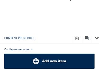
Menu
You can add a menu to facilitate navigation through the email template or highlight a specific aspect or link.

Content Properties
Once you have dragged the menu, in the Content Properties section on the right, you can start adding sections included in your menu or index by clicking Add item.
For each menu item, you can modify:
- The text
- The type of link (open a webpage or link a file, send an email, make a call, or send an SMS)
- The target, that is, whether the link will open in a new tab or the current one

If you add different items to the menu, you can click on them to reorganize:

Further down, you can change global menu elements such as the font, font color, and links, or whether you want the menu to have a vertical or horizontal orientation.
Add a mobile menu
To improve navigation and usability on mobile devices, you can also add what is known as a hamburger menu.
The name hamburger menu refers to the icon represented by three horizontal lines that indicates a dropdown menu. This type of dropdown menu is mainly used in mobile versions of pages to save screen space.
To include a hamburger menu, you must activate it from content properties. Once activated, you can customize it as you wish.

Countdown
For our users with PRO and Enterprise plans, there is the option to add a countdown.

Once you drag the countdown block, you will access a pop-up window to configure your countdown:

- Timer type: to mark a specific date (you can select the time zone and date), which starts when opening the email or when the campaign starts sending
- Timer style: normal, in circles, or with blocks
- Timer size and colors
- Language, you can select whichever you want and the changes will be applied immediately
- Text and digits font
- Background image
- The option to show an image when the date ends

Once you make all the necessary changes, you can click Save and close.
GIFs
You can include GIFs by uploading them from your computer like a normal image. If you upload your own GIFs, remember to optimize them correctly: the standard is usually around 600 pixels wide. We also have a GIF searcher.

Content Properties
It also has editable properties like the rest of the images.

Stickers
You can also add animated stickers that you can search directly in our searcher.

Content Properties
You can edit them like any other image and include a linked URL in them.

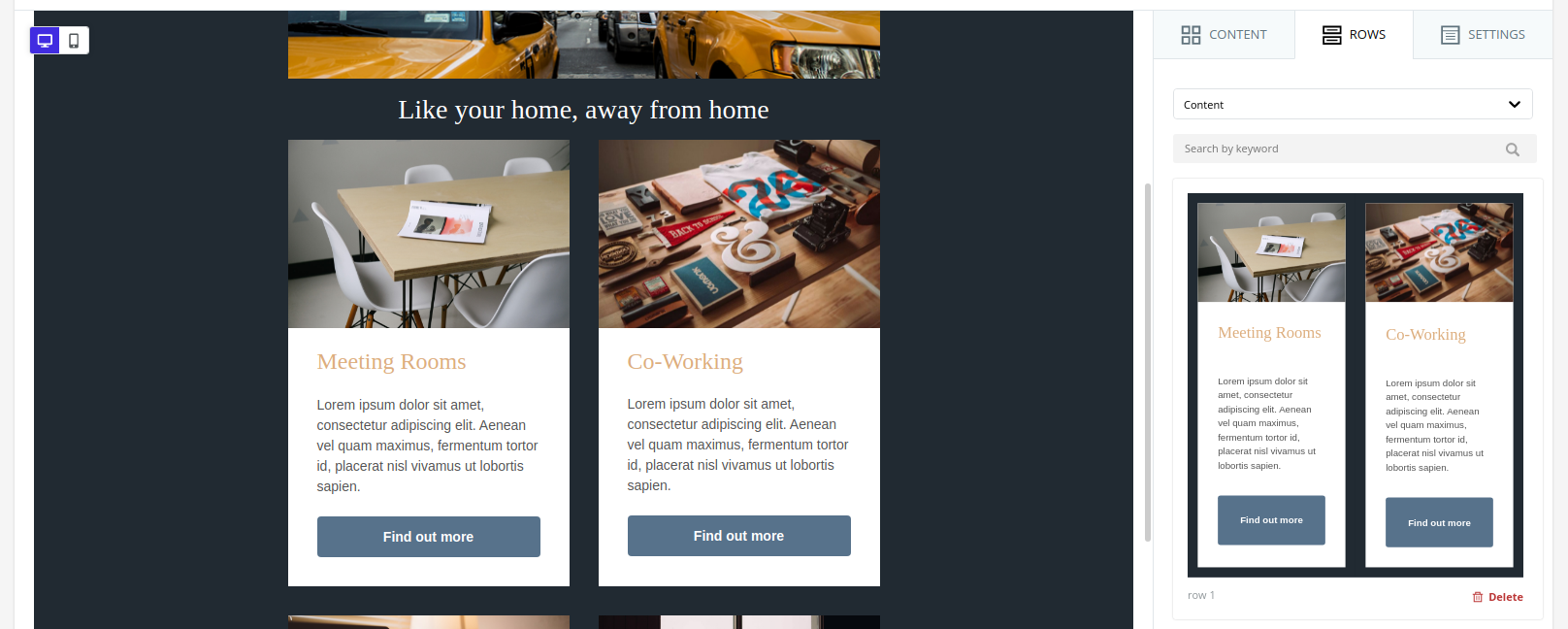
Rows
In this section, you will find different categories of rows that you can drag and include in your design.
Empty Rows
This category includes rows without content, but with different layouts that will allow you to structure your content in blocks. You can select a single row that takes up the entire width, two columns of equal size, two columns that each occupy a certain percentage, etc.
The maximum number of columns you can add is six. Keep in mind that the content you add will always be subject to the structure of the row in which it is included. This structure is responsive so the width will adapt to the viewing devices.

Predefined Rows
If you have a paid plan, in the Rows tab you will find an additional dropdown with a series of categories.
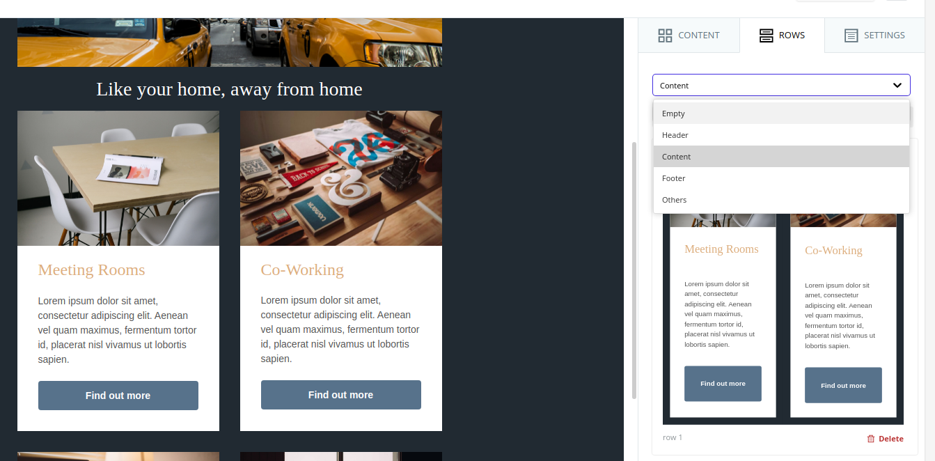
You will find predefined rows in the following categories:
- Header. Here you will find rows with useful content distribution for the header of your emails or landing pages.
- Content. Here you will find rows with useful content distribution for the body or central part of your emails or landing pages.
- Footer. Here you will find rows with useful content distribution for the final part of your emails or landing pages.
You can take advantage of these predefined rows as a starting point (both in structure and content), where you will only need to customize the colors, images, texts, and links already placed.

Save Custom Rows
In addition to predefined rows, you have the option to create and save your own rows. Once you save a row, it will be reusable in the rest of your templates.
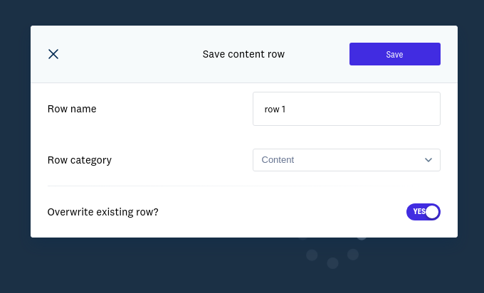
To save a row, you just need to select it and click the save button (the first of the three buttons in the upper right corner).

This will open a popup where you will need to choose the name of your row and decide under which category it will be saved. The available categories are: Header, Content, Footer, and Others.

Additionally, you must decide whether you want this row to be synchronized or not. What does it mean for a row to be synchronized? It means that if once the row is saved, you add it to x different email template designs, when you edit the content of the row and save it (in any of those templates), the changes will propagate to the rest of the email templates where the row is included.
Once saved, if you select its category, you will find it alongside the rest of the predefined rows.
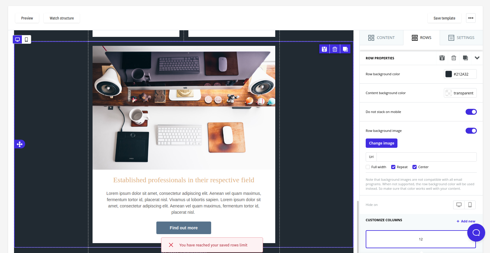
You should keep in mind that this functionality is not available in the free plan. For paid plans, depending on the specific plan, you can save a certain number of rows. If you have reached your limit of saved rows, the save action cannot be completed.
Edit Saved Row
Once you have saved a row, you can drag it to add it to any of your templates, as long as they are of the same type. This means that rows saved for email templates will not appear in the website page editor and vice versa.
Here are two possible scenarios:
- That the row is a normal row (not synchronized), or
- That the row is a synchronized row
For the case of a normal reusable row, starting from a saved row, if you drag it to the editor and apply changes to it, you have two options:
- Save a new row with the changes. This way, you will still have the original row available (the first one you saved) and this new version separately. To do this, you will need to mark "No" in the Overwrite existing row? option (default option).
- Overwrite the original row with the changes. This way, you can change the name of the row, move it to a different category, or update its content. To do this, you will need to mark "Yes" in the Overwrite existing row? option.
For the case of a synchronized reusable row, starting from a saved row, if you drag it to the editor and try to edit it, you will see that it does not allow you to do so, as the elements that compose it seem to be locked. You must click on the general area of the row and click the edit row button (pencil) or the "Edit synchronized row" button in the options on the right.

This will open a popup with two options:
- You can choose to edit the synchronized row so that, effectively, when you update it and save the changes, these propagate to the rest of the templates where the row is present. To do this, choose the option "Edit row synchronizing changes".
- You may need to apply the changes only in this specific template and not in the rest of the templates where the row is present. In that case, you can choose to unlink this row from the rest. To do this, choose the option "Unlink row".


If you edit the row applying synchronization, you will see that the editor reloads to show only the content of the row you want to edit. In this mode, you can apply all the changes you consider and click the "Save row" button.

Each time you save the row, it will allow you to update the name assigned to the row, as well as the category in which it is included.

Once you have finished applying the changes, you can click the "Return to design" button to regain the previous context and continue editing the content of your email design.

You will be able to see that the changes applied in the edited row are reflected in the initial email template, and when you open any other email template that also contains this row, the changes will also be present.

⚠️ IMPORTANT: This save action involves a synchronization process of the row in all email templates where it is present. If there are many templates, even if you see that the save action is confirmed, keep in mind that it may take a few minutes to apply the synchronization in all templates.
Delete Saved Row
You can delete rows that are no longer useful to you. To do this, you need to click the Delete button that appears in the lower right corner of each row. Once you click and confirm the action, the row will be deleted.
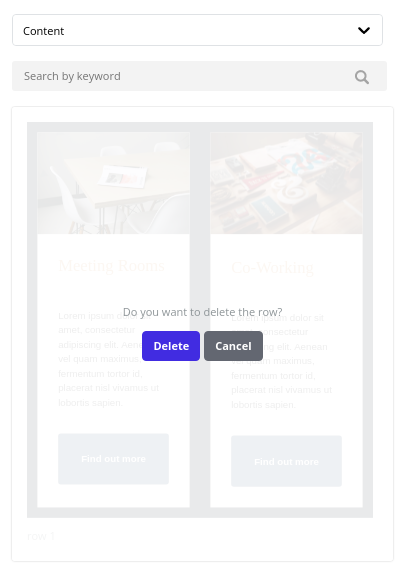
If you delete a synchronized row that is included in one or more templates, this will interrupt the synchronization process.
Add Background Color or Image to Your Template
If you want to add a specific background for your template, whether a solid color or a background image, keep in mind that you will need to modify the background for each row, as they function as independent blocks. The steps you need to follow are:
- Double-click on a specific row (from the sides)
- If you want to change the current color to another, select it on the right, in Row background color within Row Properties
- If you want to change the background to a specific image, activate the Row background image option. Then, select the image with the Change image button. In this option, you can choose for the background image to take up the full width (recommended), appear repeated like a mosaic, or be centered. If you want all rows to have this specific background, you will need to repeat the process row by row.

Settings
In this section, you can configure the general settings that affect the entire template.
You can define the maximum width of the content area, whether you want the content area to be aligned to the left or centered, the background color, the content area color, the default font, and the link color. All these properties can be modified individually in each module, but those you select here will be the default ones.

Preview / Show Structure
In this section, in the upper left margin of the editor, you will find two buttons:

Preview
If you select Preview, you will be able to see how your template will look on desktop and mobile. This is a generic preview.
If you need to preview the template on different devices, browsers, or specific email clients, you can do so in step 5 of campaign creation.
You will also be able to make changes while viewing the desktop and mobile view in the option below.


Show Structure
If you select Show structure, you will be able to see the layout with all the blocks while editing the template.

Responsive for Mobile Devices
When we use the term “responsive”, we refer to the adaptability capability of a design to be displayed correctly on different devices, from desktop computers to tablets and mobiles.
In addition to the option to show a preview adapted to different devices seen above, in the editor itself, you have specific tools available to facilitate this adaptability.
View Desktop and Mobile Version
In addition to being able to access a preview of your template, you can see how it looks in both the desktop and mobile versions on the fly while editing it.

Hide on Desktop or Mobile
All content blocks have the option to hide themselves in both the desktop and mobile versions. You can use this option by clicking on a content block, in the lower right side of Module Options.

This option gives us the possibility to duplicate our content and ensure that it is fully responsive. For example, if we see that a text is not adapting correctly to the mobile version, we can always duplicate that text and hide each one on a device, and adapt the one that will be shown in the mobile version to ensure its correct display.
Stack or Not on Mobile
This option is available so that columns are displayed the same on mobile devices as in the desktop version. It is worth noting that the more columns our rows have while keeping the "Do not stack on mobile" option disabled, the more we compromise the adaptability of our design, especially in modules that contain text.

Therefore, this option is always enabled by default and our recommendation is that it remains so. The best option is that, even if we have made a specific design in the desktop version, the mobile version has a different design, where all content stacks and comes one after the other, without distinction between columns, to ensure better visibility.
Best Practices to Avoid SPAM Folder
Both the HTML and the content you include in the email have a direct impact on the deliverability of your campaigns. Therefore, when editing your template with the editor, it is advisable to keep these best practices in mind to avoid errors that may cause it to end up in the junk mail folder.
HTML Construction
"alt" Tags in Images
All images must include their respective alt="image_content" tag. It is also very useful in email managers that do not display images until the recipient indicates so, as you can include text that will be seen from the beginning and will later be replaced by the image. But be careful, as including text that contains certain words, which we will list later, can cause your newsletter to go directly to SPAM.
Images Too Large or Heavy
Make sure that the images in your newsletters do not exceed 500kb; therefore, it is advisable to use formats like .jpg or .png, the latter in the case of images that require transparency.
Even if your image is lightweight, make sure it does not have very large dimensions. Large proportion images earn negative points in your deliveries. As a reference, do not exceed 600px x 400px, as this is already a dangerous limit. If you require your image to have these dimensions, divide them into several "blocks" that make up the different parts of a puzzle formed by tables.
Image / Text Ratio
Including a spatial proportion of images greater than that of text is also a negative element. Ensure that the spatial amount of text always exceeds the spatial amount of images. Avoid using excessively small font sizes.
In this case, the background color of a table or one of its components is not taken into account, so avoid using images if they are to fill a part of the table with a color.
HTML Content
Message Writing
You should try to minimize the use of uppercase in your sending, as well as repetitions in exclamation marks (¡¡¡!!!) and question marks (¿¿¿???). Try not to duplicate content within your sending, nor repeat phrases or words more than strictly necessary, especially if they are amounts of money or currency symbols. Of course, no inappropriate or offensive words.
Try to avoid overly commercial writing; a personal touch will always be a point in your favor. You can achieve this by using a personal email as the sender, adding a postscript (the most read part of an email) in your template, and using a personalized greeting.
Finally, always carefully review your template to avoid any spelling errors in the writing.
Text Generation with Artificial Intelligence
In some blocks, it is possible to automatically generate texts with the help of artificial intelligence. This is available only for Pro and Enterprise users and in the following blocks:
To generate the text, just go to the "Content Properties" of the block and click the "Write with AI" button.

This opens a new view with a text box, where you can enter a request, based on which the text will be generated (by clicking the "Generate" button).

It should be noted that all generations take into account the previous requests that have been made. To reset the history, you can click on "Restart with a new topic".